
The Thread
In short
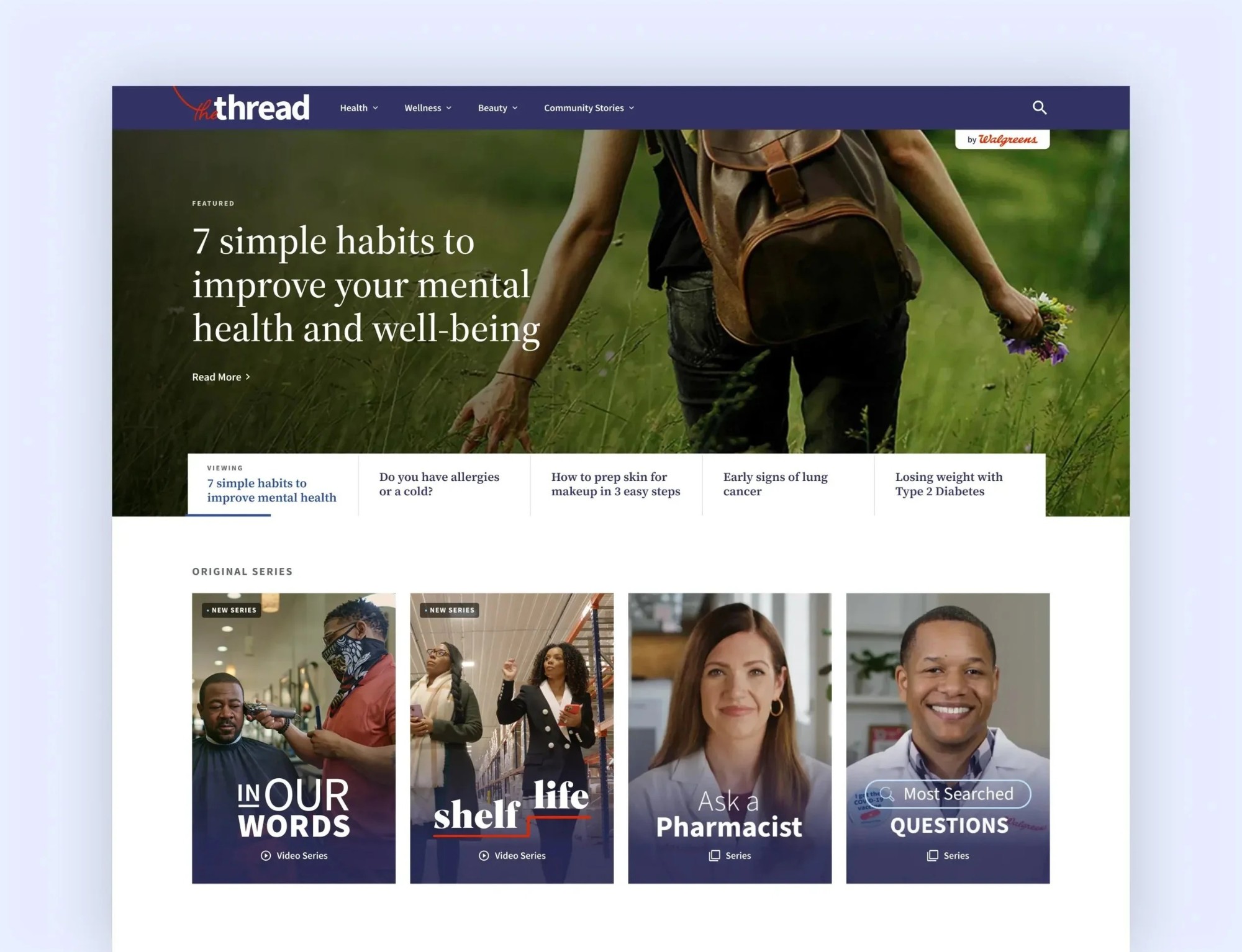
The Thread is Walgreens' content hub: health, wellness and beauty articles, recipes, and original video and podcast series, all under one roof with a search that actually finds them. Years of that content had been scattered with no central home, so none of it was earning its keep in search. I was lead internal designer, working with the agency that built it, and The Thread went live in December 2023.
Walgreens had years of good health content and nowhere to put it. I was the lead internal designer on the system that became that place, from the first prototypes to the user flows the agency built against.
Years of content, no home
Before The Thread, an article on allergy season and a recipe for a diabetes-friendly sandwich could both exist and never meet. They lived in different corners of the web, so search engines saw a pile of scattered pages, and a reader who found one rarely found the next. A content library without a center is a junk drawer: everything you need is in there, and you'll find it right after you've bought a second one.
So the job was a home first and a redesign second.
One type scale, every format
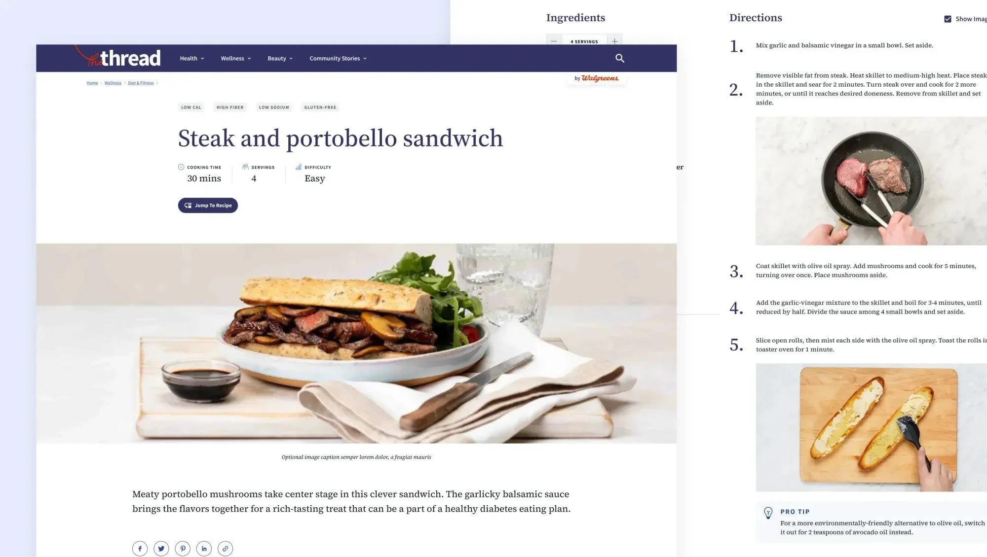
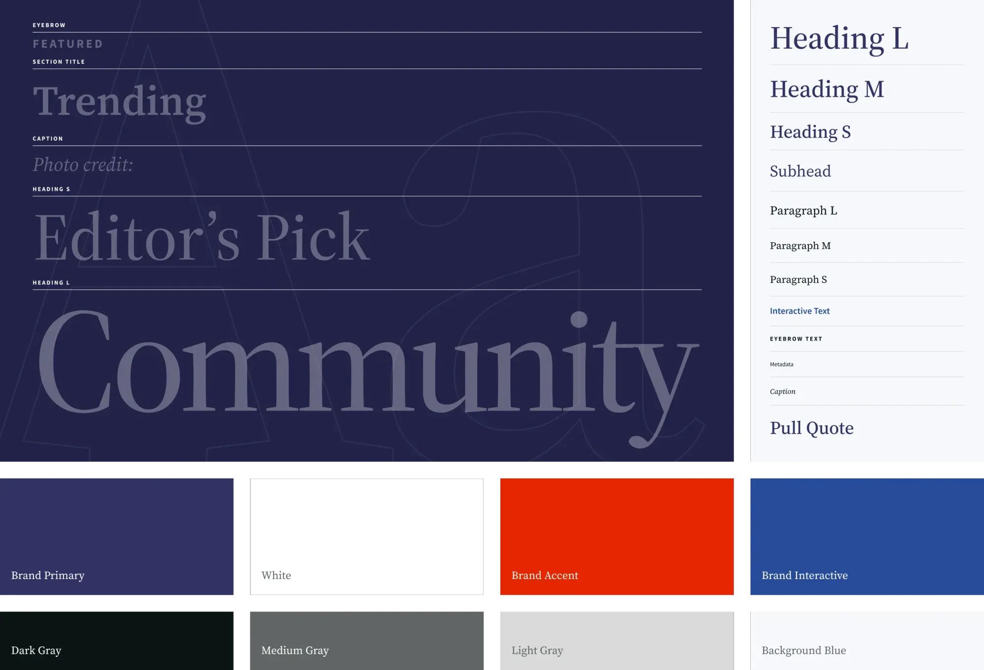
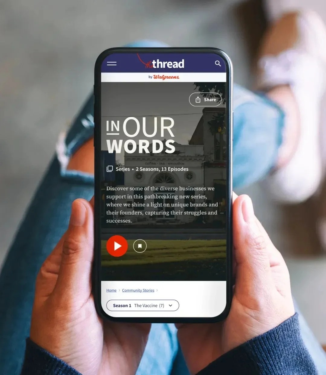
The Thread had to hold articles, step-by-step recipes, video series with episodes, a podcast player and search results. Every one of them came out of the same serif type scale and the same eight colors, from Brand Primary navy down to Background Blue. That was the trade, made on purpose. A recipe page gave up its own fonts and a new video series gave up its own palette, and in exchange a reader moving from a mental health story to a steak sandwich never felt they'd changed websites.
Widgets the teams could place
The design driver I'd point at first is the embeddable widget. Internal teams needed to publish on a regular rhythm, and every new story that waited on a designer was a story that went out late, or not at all. On the Shelf Life page the episode list, the related stories and the other series are stacked modules, and the same pieces turn up across the desktop templates.
My part was the Walgreens side of that system. I built the initial prototypes, kept the agency's design system aligned with the Walgreens brand and supplied the assets it ran on, then gave UI and user flow guidance as the templates came together.
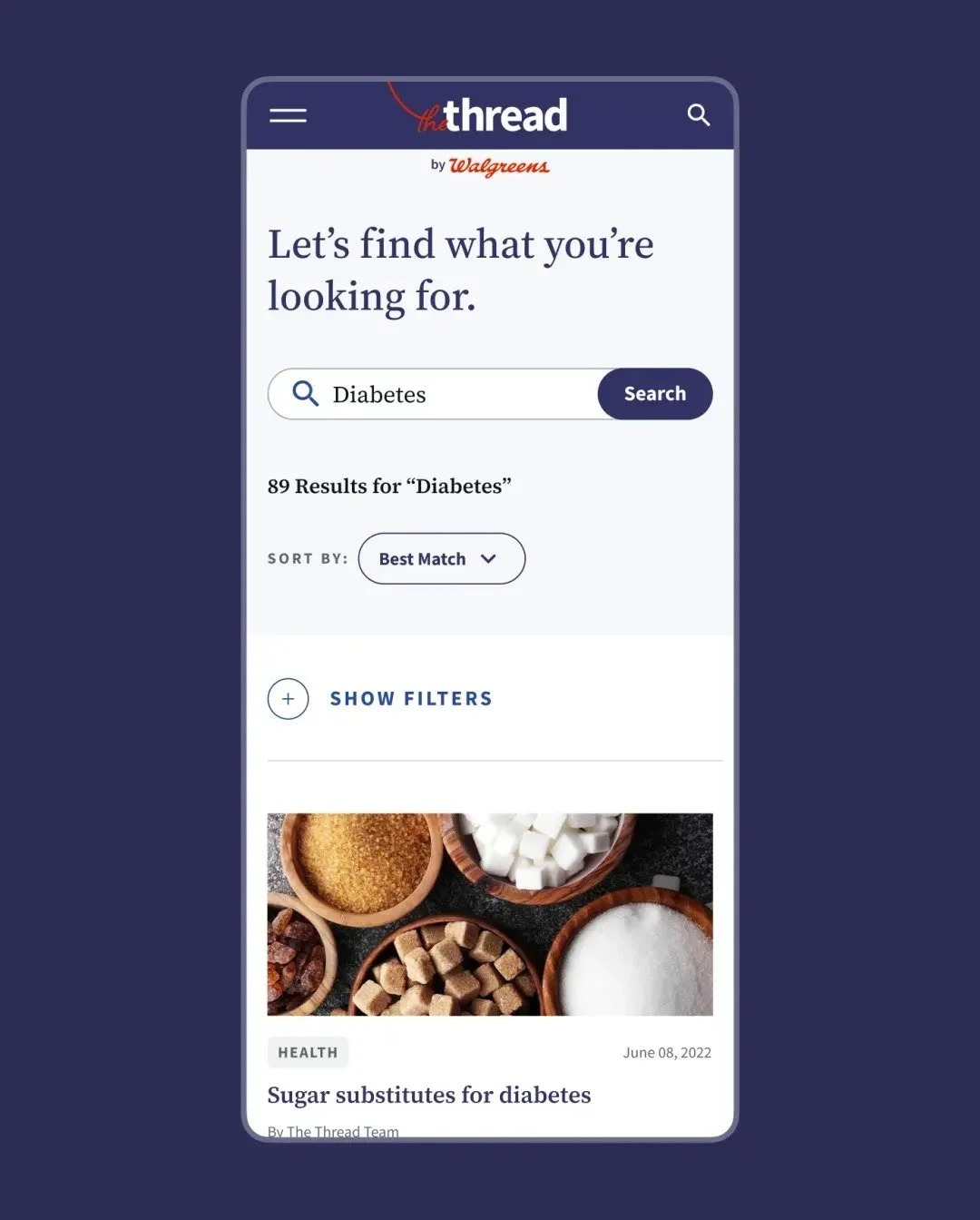
Search got the same care. Type Diabetes and you get 89 results and a sort menu, with the filters folded behind one Show Filters line, so the page leads with answers before it asks you anything.
What I watched
The goals were search value and a closer connection with readers. Walgreens keeps that reporting, so there's no figure here from me. The Thread went live in December 2023 and it's still running at blog.walgreens.com.
My favorite small thing is the 404 page. It says "Looks like we've lost the thread," then hands you a search box and a row of trending topics.
Behind the work
- Company
- Walgreens
- Launched
- December 2023
- Role
- Lead internal designer
- Scope
- Design system alignment, initial prototypes, UI and user flows
- What I was solving for
- Years of health content with no central home, and teams that needed to publish without waiting on a designer.