
Compare Canto
In short
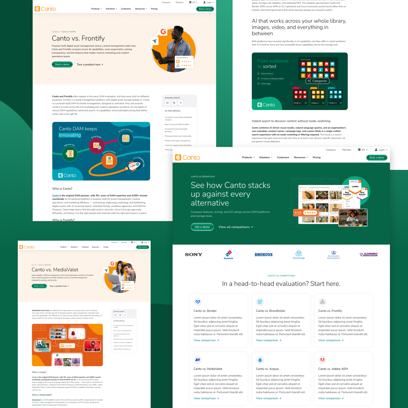
Compare Canto puts DAM alternatives, pricing and G2 reviews on one page, for a reader who has a competitor's site open in the next tab. I designed and built it on the Nuxt site, inside the design system I owned. Anything overstated costs more than it earns.
DAM alternatives, pricing and G2 reviews on one page. Dense comparison content that had to stay honest, because whoever is reading it has a competitor's site open in the next tab.
Nobody trusts comparisons
Everyone knows who wrote it, and how it ends is not really in doubt either, so this one covers the alternatives buyers actually shortlist, with pricing and G2 reviews sitting next to the claims rather than underneath them. Anything overstated costs more than it earns, because the reader is one tab away from finding out, which makes an inflated claim less like marketing and more like lying about your height on a first date where you're both already standing up.
Evidence beside the claim
Reviews sit beside the claims rather than in a testimonial section further down, so a claim and its evidence land in the same eyeline. Real numbers go where a skeptical reader goes looking for them, and the columns stay readable at the width people actually browse at. I traded skimmability for it. Every version I tried that was skimmable had taken out the part doing the work, so it's long on purpose.
The design system
It lives on canto.com, so it runs on the Nuxt site and inside the design system I owned. I built whatever the comparison needed out of components that were already there, or it turned into one. My rule for that is boring and it holds up: first time a pattern shows up, document the exception and move on, second time it's a gap worth building. This page put that rule to work more than once.
The German-market version
The copy team wrote the hub and the post pages, then did it again for the German market. That second pass is a rewrite. A claim that's fair in one market can be meaningless in another, and catching that takes someone who knows both the product and the language. Working next to it made me more careful about the sentences I'd been treating as neutral.
What I watched
Clicks into pricing, and form submissions from people who arrived skeptical. Canto holds those numbers. The bet was that this visitor converts later and with fewer questions, because the objection handling already happened on the page instead of on a call. It held up.
The test for a comparison page isn't whether it makes you look good. It's whether a competitor could read it and find nothing to correct. Aim there and the honest version turns out to be the persuasive one.
Behind the work
- Company
- Canto
- Date
- 2026
- Role
- Design & front-end
- Platform
- Nuxt, on canto.com
- What I was solving for
- Everyone knows who wrote a comparison page, and how it ends is not in doubt either. Anything overstated costs more than it earns, because the reader is one tab away from checking.
- What I learned
- Working next to the German-market rewrite made me more careful about the sentences I'd been treating as neutral. A claim that's fair in one market can be meaningless in another.